Introduction
For the Factual piece, I chose the Delicious Peace, for this piece I was asked to complete a 40-second advert for a forthcoming series for the National Geographic Channel. I created an advert for 40 seconds and I feel that even though some parts could still be improved in order for it to be at a professional level of which I will discuss and evaluate below.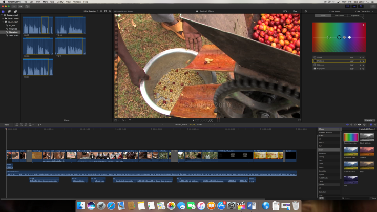
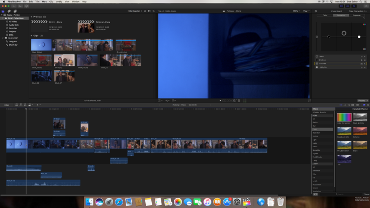
 To start the process I began by Importing and organising all of the footage into different keyword folders, I did this because it made the editing process more fast and effective meaning I didn’t have to sort through anything whilst editing together the 40-second piece.
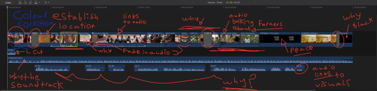
I then went on to begin editing together the advert for the national geographic channel, about coffee makers in Uganda. During the process of editing, I decided to start off with a few shots of coffee beans being poured in these shots I slightly colour corrected them to make them pop a little more.I did this because at the time I felt that it was more likely to attract the viewer’s attention and be more aesthetically pleasing to them. I chose to start off with these shots because in a lot of adverts about coffee beans somewhere near to the beginning of the advert there is a shot of coffee beans being poured which I wanted to emulate because I felt that it would capture the audience’s attention and encourage their further interest throughout the 40 second advert.
I then listened to the narration tracks and after choosing the tracks I thought would go best with the visuals provided I added in the narrations in an order of which I thought would go well within an advert and then added in the visual corresponding and linking to the narration. I did this because I thought it suited the adverts purpose to advertise a new upcoming series for the national geographic channel. I thought that the narrations I chose were suitable and went well with the visuals the way I edited them together so that the clips linked to the narration. I also went with the soundtrack that came with the footage I did this at the time a lot because of convenience although I feel that the soundtrack did suit the visuals and audios and went with the whole theme of the advert.
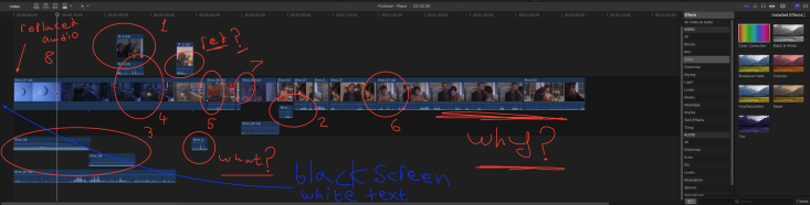
I also added in map graphics early on in the advert as I thought it was effective as it helps the audience to associate and be informed from the very start that these coffee makers are in Uganda. After watching the visuals and doing a few trims just to finish off the visuals I added in 3 crossfade visual transitions I did this because I thought that the three transitions I put in there needed to be in there for things to be a little less jarring the first I went from coffee beans to the map graphics then I added in a crossfade from the nature to the farmers picking beans which I did beacause I thought it made the narrration transtion to talkning about the farmers more effective I the ended with a crossfade to black. I did this because I thought it was an effective way to end the video for the audience. Throughout this process I also used some of the original audio from some of the clips and faded it in and out I did this because, I thought it would give the advert more of an appeal towards the audience rather than either no audio on the clips only and soundtrack or no fades which would have made the cuts a lot more jarring for the audience.

Conclusion
To conclude throughout the process of the post-production of the advert I chose to prioritise emotion, story and rhythm of the six of Murchs rule because I felt that they were the ones which would suit the audience best. this is because foremost if the audience feels emotional towards the people in the advert they are more likely to watch the upcoming series, if the audience felt a hint of a story but with no ending it could intrigue them to want more and finally by having a little rhythm it added a bit more interest for the viewer watching the advert whom would expect a good rhythm in the upcoming series, therefore, promoting the series and serving its purpose to advertise. Although I feel a lot went well I feel that I could still do with improving upon my natural sense as for when to cut certain clips together as well as making sure every shot makes sense. I will do this by further practising my abilities in these areas of editing.