
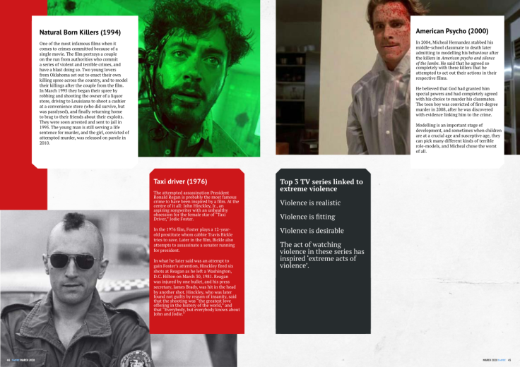
For my creative practise artefact idea I decided to do an anger management campaign that would help with managing, preventing and bringing awareness to it. It would have a website, app and card kit, However, after delving more deeply into the context of where it would go, who would use it and the connection between media violence and a direct cause, I decided to discard the idea because there wasn’t a completely concrete connection to watching violence and being violent, as well as due to the factor of not having a context as to where it would go, and who the target audience would be. I went with my other idea for the artefact, a magazine spread on media violence, about popular films, series linked to ‘acts of violence in real life’ with a Q&A with from an academic on media violence. For this magazine spread I looked at a few magazines such as Esquire, total film, pilot, empire and more, however, in the end, I decided to go with Empire for my magazine spread because the films magazine has various spreads in which have films, and series talking about them, as well as special features on Q&A’s and interesting topics on media forms(Tv and films). Therefore my spreads on media violence should be appropriate to be in the empire magazine and would be accessed by the readers of the Empire magazine.
Empire’s Target Audience is predominantly male readers who have a keen interest in mainstream films; ‘Empire’s’ average reader is “30 years old, living and working in London. He is funny, smart and switched-on. According to their website, 76% of readers are male and are often also read by affluent ABC1 movie fans and cinema hounds. Therefore the preferred target audience should have an interest in reading about violence linked to popular media pieces such as films as they have a keen interest in mainstream films.


I created a very rough layout with some columns and other ideas to visualise how the spread will look. Then after looking at the 2018 empire limited issue, I liked the design of paper texture rather than just basic colour scheme and thought that the rough texture of the paper would fit the theme of violence better than just clean non-textured colours. I decided I wanted to use this design of a paper texture rather than plain colours, although I didn’t have a clear enough visualisation of how the magazine spreads will look.


So I looked further into various Empire magazine issues I gained a better visualisation of how the magazine spread would look, as to the elements of the cover, grid systems, the fonts that could be used and design elements being used in the empire magazine issues, however, I decided to go against some design elements such as warp text which has being occasionally used through the issues of the empire magazines because it is easier to read and is more aesthetically pleasing to the eye.
For the backgrounds of the spreads, I went with a paper texture theme throughout with at time overlapping paper textures, I did this because it allows there to be further separations from the other elements whilst at the same time adds a new and different element creating interest, and something new that the reader may not have been expecting. For the main body and text informing the reader about the films and violence linked to them I decided upon a border around the body of paragraphs much like the one in the image on the left, I have decided to go with this because it separates the design elements in the spread from the main image, the background and the text bringing focus to the articles. However, for shapes of these boxed filled borders, I decided upon a diagonal edge rather than a rounded or straight edge because it makes the blocks look similar to film tickets that have been stuck to photos/ are hanging from them, I did this to add a twist to the design to make it more interesting to look at and read. For the text I went with Sans typefaces for the headings, subheadings because this is the format of the Empire magazine, I also did this because as it is a geometric font based on geometric and rigours shapes, they are more modern and used less for body copy. They have a general simplicity. Calonaci, D. (2016). This simplicity delivers the focus more to the body of the text which, I went with a Serif font because it is the format of the Empire magazine, as well as because of the general readability and better definition and flares because of the small ligatures called ‘serifs’ in this case Calonaci, D. (2016).


I used the traditional 10 size font to 12 leading(space between the lines of text) for the body of text, however, I went against this somewhat at the beginning for a title to start off the spreads on TV and Films. Rather than following the rule of +2 I went with a much larger leading because it better suited the design and is more aesthetically pleasing and interesting to look at. I kept the kerning of the text to the standard settings throughout because I don’t’ think it will fit the overall design layout. I justified the alignment of the text to the left because that’s how most text throughout the empire magazine is formatted and because the eye reads from left to right and so it makes it the optimal format for reading easily. However, I didn’t do this for the adverts in the spread to make the artefact look like it could be in Empire magazine, I justified centre for these following the layout of adverts scene throughout various Empire magazine issues.
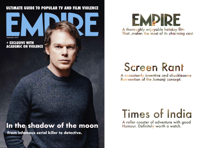
I designed the front cover after looking at several different issues of Empire, following a basic design layout I used hierarchy to create levels of importance as well as the format of previous Empire issues. I did this to create an aesthetically pleasing, readable and fits the design of the Empire Magazine.
The finished artefact should be read by the preferred audience of the empire magazine as it is in that format and it has content is suited to the Empire magazine, however, had I gone out of the realm of the strict rules used in the Empire magazine and gone experimental it could have appealed to an even larger audience, however, I did not do this as it wouldn’t have fit with the theme I was going for. Throughout the magazine, the design techniques are mostly sound, the grid systems are accurate to the Empire magazine, although on done spread with two series on there is a little too much empty space and Rag on some of the body’s of paragraphs could have been better and this may have made reading the paragraphs difficult for the reader. In the section on the Q&A, I did not use a photo of the academic whereas in most of empires issues there usually is this could have effected that particular spread and it may not be read as much as the others because of this because the interest may be lost. The adverts and spreads I did on media violence where appropriate, although I could have gone even further and done a view spreads on something such as ‘Top 5’ goriest scenes of all time, overall though this spread on media violence fits the idea of an empire magazine spread and explores the effect media violence can have. A few improvements that could be had, on this spread is more experimentation with the spacings of text and perhaps more expressive type fonts to gain more attention from the reader. Also, one final improvement would be to ensure all photos are of high resolution as some in this spread are a little soft and out of focus looking at times.
Calonaci, D. (2016). Practical Responsive Typography. P. 5, 9.
