For this project which is an experimental avant-garde short film, the motion graphics required for the advanced fictional are the following:
Simple title giving the name of the film as well as producing a mood.
Finishing credits.
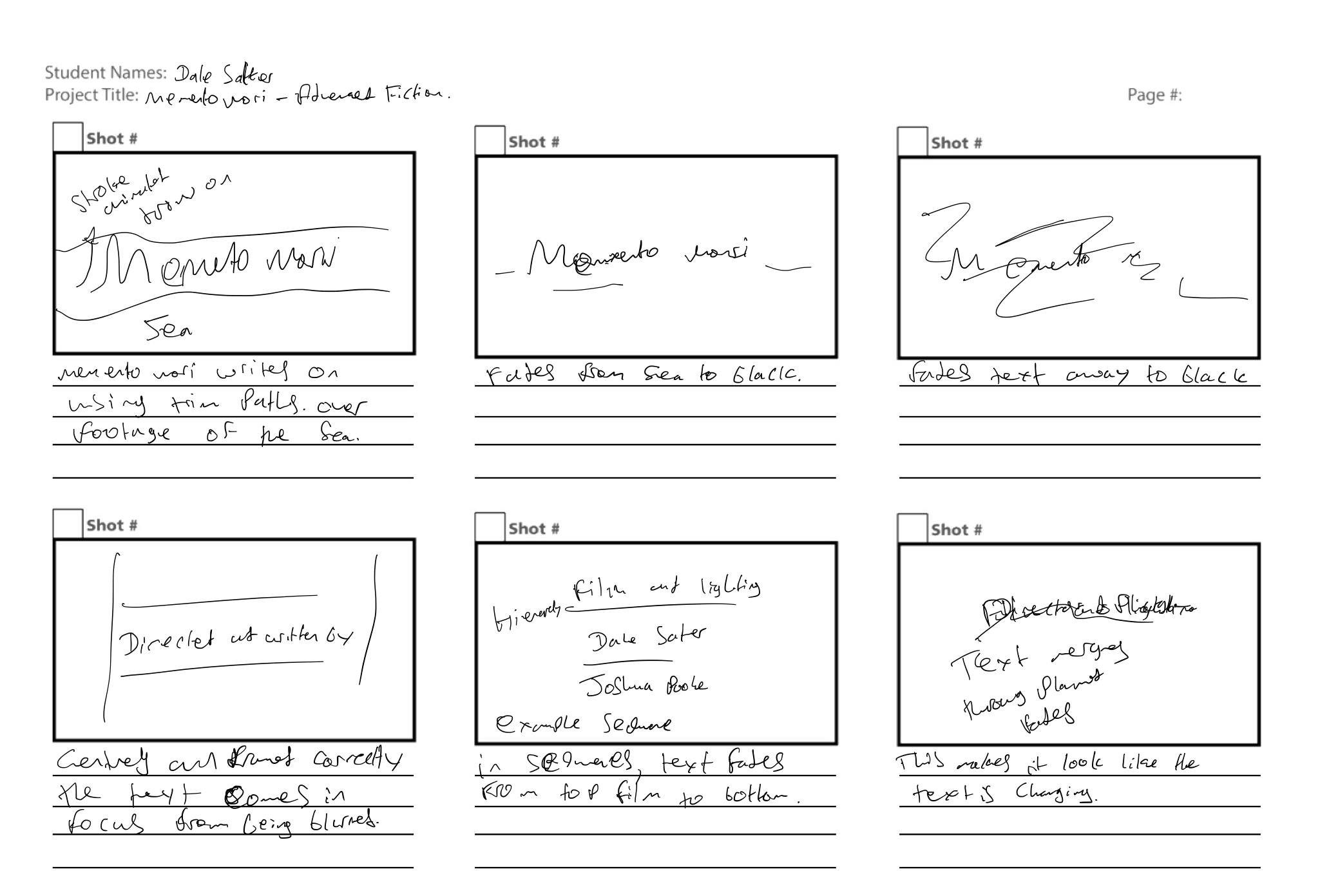
Beginning title Memento mori
For the beginning title, I looked at short films but I didn’t find what I wanted, However, I did find a title sequence I liked the look of and took inspiration from it as shown below.
I liked some of the drawing animations used in this sequence. After thinking about how I wanted the title to go and creating a storyboard I looked into some tutorials on how to go about animating text to be drawn on.
After watching this tutorial which I found most helpful shown above of how to create a handwriting effect, I looked into some fonts that use connective writing as shown below, from the Practical Responsive Typography. I looked into different scripts but they weren’t all that readable so I decided to just use a font that was legible and use it as a base and draw around it to make it fully joined in mask form.
This slideshow requires JavaScript.
The typeface I chose to do this is Apple Chancey which is a script like the ones shown in the screenshot above and is a lot more readable. I wanted the piece to have a flowing, hand-drawn effect to it which could infer that it is the character that wrote it. I wanted the text to have an Experimental, Avante grade look to it. Following my storyboard, I utilised what I learnt from the tutorial and traced the fonts and altered it until it got the look I was going for, I then animated the text in by using trim paths and sizing up a circle filled as the dot on the Mor(i). I then added in footage of a wavefront and aligned the text correctly following a grid as well as lining it up to write on the horizon line of the sea following a rule of thirds horizon line technique. I then faded the background to black and then the text to nothing leaving a blank screen.
Finishing Credits
For the finishing credits, I researched into typefaces that are the most legible through the use of the practical responsive typefaces book/guide. I decided to use a Georgia traditional sherif typeface because according to Practical responsive typology “They are neither antique nor modern and they date back to the 1700s and are generally numerous. They tend to abandon some of the diagonal stress, but not all of them, especially keeping the o. Georgia and Baskerville are some well-known examples.” I didn’t what the time to be set as the Avante grade piece is not really set in a specific time in history.
This slideshow requires JavaScript.
After creating a storyboard to visualise the idea I then used it as a guide to creating the end credits as well as following a layout guide as shown above I created as well. I created text and aligned it by using the correct spacing(Tracking between grid squares) I did this to be exact with where the text should be and to get the most effective readability from the text. I then used opacity changes to introduce the text in as well as a blur at the start to introduce the audience into the end credits. This could have been improved to be more efficient by using source text animation. I decided to go with fades rather than writing out effect because I wanted more than anything readability rather than to generate a mood in the audience which using Georgia(font) does.
Final evaluation of motion graphics
Overall the motion graphics in this piece is effective at creating a mood and is legible, however, at the beginning the second word mori doesn’t quite match the look of the memento and has room for improvement. The alinement throughout is effective and the first title placed on the horizon of the sea works well, as does the alignment throughout of the end credits. However, in reflection, these motion graphics could be brought to an even high level of professional standards by in the future researching further into other short films of the genre and compiling the best typefaces and animation to get the most attractive and pleasing, legible to the audience motion graphics. I also think that the right amount of motion graphics has been used and any more may have been too much to put this piece to a professional standard.
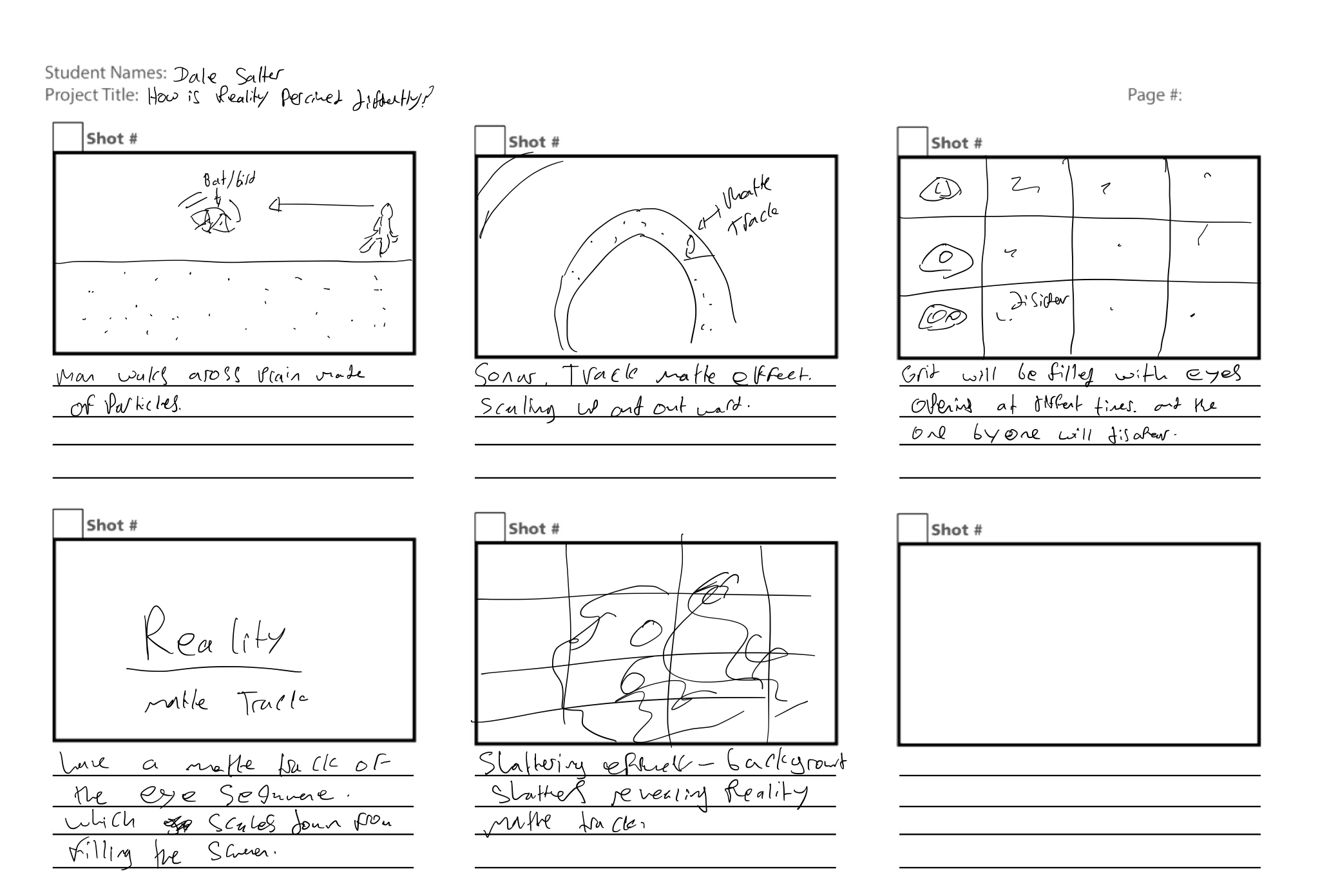
I rethought the idea of sonar/eco-location and decided I wanted a man to be walking across a plane with birds flying across the frame. I came up with this idea after thinking about how blind people can use sounds to locate obstacles and walk and thought the idea of particles rather than completely coherent objects added to the composition of echolocation as a means of perceiving the world differently. I wanted this idea to have a more in-depth and interesting feel to it and so I added flying objects which could be provided as bats with the correct sounds and would further add to the idea of echolocation.
I created a plain with humps in it to add more interest than just a level ground, I then animated the man in a walk cycle across the horizon line. I did this because according to john harris(BhPhoto) “The Rule of Thirds posits that a visual composition is most pleasing to the eye when its compositional elements conform to an imaginary set of lines that divide the frame into equal thirds, both horizontally and vertically.” Following the rule of thirds, in this case, was appropriate although in most cases isn’t and things of relevant shouldn’t pass the title safe zone in motion graphics pieces.
I then animated a basic mesh of a winged animal which could be perceived as a bats wings, I then duplicated the mesh and animated them filing across the scene in a wave over the x-axis rather than straight across to add more depth to the scene. Used a particle system on each object in the scene linked to a group of differently coloured emission spheres. I created this in Blender rather than filming it and just using a colour grade because I wanted it to have more depth and controllability as well as the fact that I knew how to create a ghosting effect in blender however doing this in camera would be troublesome and I didn’t want it to just feel like the dark knight sonar I wanted it to be made up of particles forming objects rather than fully formed things. I also did it to illustrate/infer to the audience a visualisation of how the world can be seen differently not through vision but through sound in eco-location. I could have done this in after effects fully however I didn’t not because it would have to be more work and might not have been as in-depth and feel like a 3d space.
I used blue and green(RBG Primary) colour tones in the sphere groups first, I used these shades of colours because, I wanted to infer the environment and nature which green does, as well as giving it a blueish hue which I liked in the dark knight. I didn’t follow the conventional colour rules of complementary colours because I wanted minimal colours and complementary colours wouldn’t let me get the look I wanted which was more tones of colours because I felt the complementary wheel was too jarring and it didn’t suit the piece. I went with analogous colours of blue to green which suited the project better.
I went with a black(Subtractive Colour) background because I wanted it to not attract the attention of the audience, I wanted the focus to be on the blue and green particles of the movement. This worked for the piece, however, a matte track of blurred footage could have been used as a background to add to the reality and make it more coherent with the piece. I then in the compositing stage of exporting from blender added a slight glare and a ghosting effect, I did this because It adds more interest, depth and more of a feeling of echolocation in the shot. As shown in the video below.
For the echolocation effect, I decided to use Matte tracks over the exported scene from blender scaling up and filling the screen. Therefore revealing the scene. I got the idea from how sonar is being used in the dark knight as well as how it is portrayed on screens in ships using sonar. I created the effect by using 3 circle strokes in a pre-comp that scale up and out of view on the screen, I then grouped all of the different locations of circles scaling up and matte tracked them over the scene. I did this because it was the most effective way of revealing a scene other than masking which wouldn’t have been effective and would have been time-consuming.
For the start of my factual piece, I decided I wanted to do something with footage of eyes, because of it being about how reality is perceived it was poetic. I decided to edit together a sequence of different eyes opening, with different colour grades, I experimented with this as shown below.
However, after consideration and experimentation, I thought that it would be better to have the sequences of eyes opening with different colour grades in a grid style because I think it will add to the experimental feel of the piece, opening the eyes sort of invites the audience into the piece and it goes with the idea of how reality is perceived differently by using different colour grades and eyes opening in different sequences. I thought this style would work better because the eye-opening was already a facilitator of the narrative/mood of the piece on how reality is perceived and it added a lot more time to a piece which needed to be 3 minutes and no longer. I gained the idea of using some kind of boxes of video clips and inspiration from the video below and built upon it.
After storyboarding my idea I researched into some tutorials on how to create a shattering effect as I didn’t know how to do this already. I gained the most useful help from the one above. I then started to create the starting titles for my factual. I started by adding in the footage of the eyes and lined them up to upon at the same time or within the same second. I did because of the efficiency of time management and to infer meaning as talked about in the above paragraph. This worked however, I didn’t use any measurement and so the grid was off at points it worked for the piece however in the future I will improve upon my motion graphics by using measuring grids and techniques to make my motion graphics more precise.
This slideshow requires JavaScript.
I then For the Beginning Eye Title Sequence(Reality), I decided to use a Sans Serif typeface(Avenir Next – Regular)Font. I went with a Sans Sherif Typeface because according to Practical response Typology – “Typology is a humanistic font which has a friendly tone due to the calligraphic style with a mixture of different widths characters and, most of the times, contrasted strokes.”– I did this because I wanted to make the audience feel a little more at ease with the friendly tone. I experimented with mirror in the text on the vertical, however, I felt it would be too much and not be readable and so stuck with just the basic text. After this, I pre-comped and duplicated the grid of eyes opening and then disappearing one by one and then used one as a background and one as a matte track for the text. I then upscaled the text to fill the screen and reversed it so it went from a letter to the full word reality. This went well and I got the desired effect I was going for, I then created a shattering effect, which I wanted to do for the background of the eyes opening. I did this by animating the shattering effect with the texture of the eyes rather than just being a glass barrier, I also added more complex shatter patterns to add the effect of reality is shattered. I think this effect is appropriate to the piece as it shows reality being shattered which goes with the whole idea of reality being perceived differently.
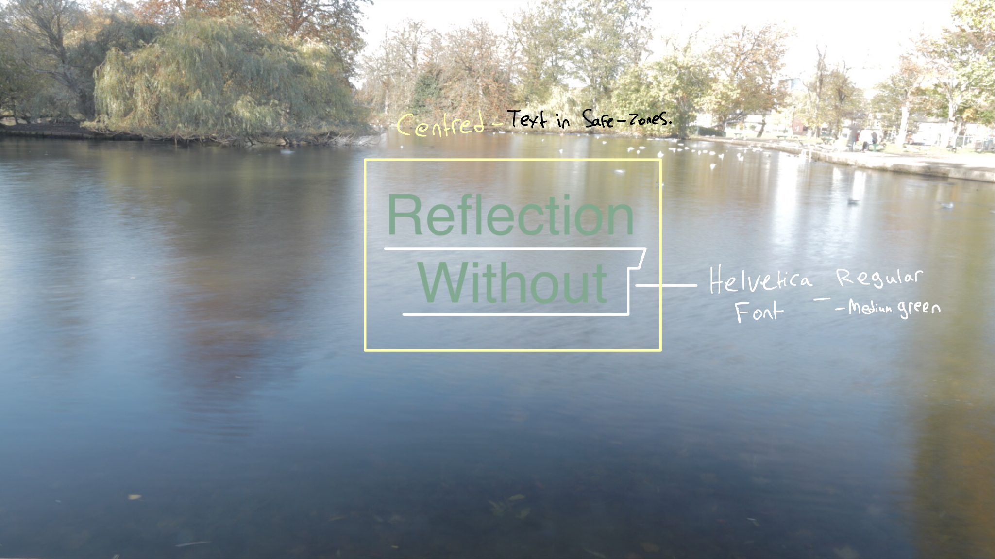
I created a storyboard for the still images because there was no movement and it wasn’t necessary. For the still images with different exposures, I decided to use a Sans Serif(Helvetica Regular)Font. According to Practical Response Typology – “They generally give better readability in print than on a screen, probably because of the better definition and evolution of the former in hundreds of years, while the latter technology is, on an evolutionary path, a newborn.” I wanted the piece to be readable and simple which it does, I then decided on a green(RBG Primary) colour because I wanted to go with a colour which infers nature. For the text I used the safe tone and centred it in the middle which follows the rules of motion graphics, however, I didn’t use curning and other techniques which may have made the text more effective at informing the audience.
Overall for the experimental nature of this piece, I think the motion graphics suit it, however, the motion graphics used for the still image long exposures are not very readable and clear and the colour green was not the best choice. This could be improved by using more readability and higher clarity colour such as white and a more bolder version of the font. For the beginning titles, I think it is appropriate for the piece being experimental and about reality being perceived differently, however, it could have been improved by following more motion graphics rules such as the curning of letters and the spaces between the words below and above. This piece could also have been improved by using a grid to line up the footage of the eyes more accurately. For the motion graphics of the echolocation and think it is appropriate for the piece and effective at expressing to the audience how reality is perceived through eco-location. However, it could have been better by implementing it with footage to make it flow more in the piece. I could have further improved the motion graphics in this piece by researching into similar pieces and looking at beginning motion graphics and typefaces used on still images to make this piece more of an effective motion graphics piece.
Research around ownership, funding, ownership structure. – who owns what, broadcast you need case studies.
for broadcast get two case studies imdb budget, background – find out how they are funded and who owns it. – case studies are going to be by Chanel BBC – licence fee payer, ITV, channel four, – funds drama for upcoming drama piece makers – public service, Netflix
Interviewers – how do you think the industry is funded.
broad question – discuss the future of British funding in the broadcast.
Look at drama pieces – discuss – research is an online/book – look at the structure look at the funding.
How does the industry work? – how to get into broadcast – as a camera operator – commision editors.
Where do I get money?
Question what costs need to be considered to be a camera operator in broadcasting? – this could involve travel costs, equipment costs, funding costs.
Broadcasting History – Power without responsibility book
Reith and the denial of politics
There are only two accounts of the origins of the BBC. The first is that the corporation was the personal achievement of John Reith. The second is that its emergence was accidental.
Book Research – Book One
The media studies reader – edited by laurie ouellette
Book Research – Book Two
Seventh Editition power without responsibility, press broadcasting and the internet in britan.
For this proposal I have researched into various techniques, colour, shot and project ideas to further develop the project based on the genre experimental/Avante grade thriller as shown in the main journal/appendix.
The Introduction
The working title for the film is ‘Memento Mori’ written by Thomas Hird and is set in the old fishing town of Whitby. It is about a guy who wakes up on a beach not knowing where he is. The idea is that he is trapped in a world and he is constantly trying to find warmth, shelter and food. Each time he falls asleep he wakes up back on the beach and is stood in a loop. After multiple loops, he tries to escape and fails. Every time he wakes on the beach he sees a church on the cliff, on the final time he wakes up he heads towards it to reveal his fate.
Working Title: Black (Working Title)/ Memento Mori
Production companies:
BlackThorn Pictures
Ruki Productions
Simmaberg Studios
NaCl Productions.
Team Members: Dale Salter, Tom Simmerson, Thomas O’Malley, Josh Poole.
Statement of Intent / Objectives
The aim of the video is to be around 9-10 minutes long and is an experimental/avant-grade thriller piece based around death. There is a lot of association around religion however we want to keep the film contemporary and up to date so we also don’t want to rely heavily on a specific religion. We aim to combine multiple religions and ideologies into the film to leave the narrative and the semantics to the audiences own views.
Target Audience
The target audience for the film is open to all ages from 15 upwards. We aim to not have any violence or inappropriate language or scenes so that it is suitable for teens. The reason we have a wide age range is that we aim to get to see what audiences take from the film.
Synopsis
A man wakes up on a beach alone and cold and start walking looking for shelter, hope and anybody. The character goes through sequences of going from the beach and finds something different(food, an object) then as soon as he becomes unconscious he awakens on the beach again. Eventually, he starts to notice that the sequences are really happening and he attempts to escape town but fails and wakes on the beach again, but this time something is different he notices for the first time that dark figures have been pursuing him. He tries to get away from the figures in the darkness but is blocked at every turn with no place to go he is drawn towards the Abby only to be trapped in there and the dark figures come towards him extending their arms. He takes their hands and they lead him into darkness accepting his fate for he is dead and in purgatory.
Treatment
Techniques that will be used in the short film are Juxtaposition, conventional and unconventional framing, wide and narrow focus apertures. Editing techniques such as graphic/ match on action will be used at points to hide some cuts and make the project flow better. Other techniques may be used such as low key lighting with the use of colour gels and such.
The crew that will be required are:
A camera operator, Lighting engineer, sound designer, director, logger.
The equipment that will be required for this piece is in the document below:
3 nights in which to film – 26,27,28 of March – 2019
Deadline:, Get visual lockdown by 1 May. 10th May Finished video.
The date of the production will be from 26th to the 28th of March 2019 and the deadline for the finished product is for 10th May 2019, this will allow us to have a finished piece of work to hand into film festivals over the summer.
Get research to clarify what your creative response is
https://www.youtube.com/watch?v=Vob1-3Wfps4 – Stretford Salvation Army Promotional video – this kind of format showing events, reactions rather than just a head/voice over explaining it. I want to make sure to get more aesthetically pleasing shots rather than the shot which just has some borning shots like of a pan of the tins and some unprofessional handheld shots. – Use visual storytelling in conjunction with motion graphics.
The look needs to be warm, cozy soft light goog composition, soft out of focus backgrounds, out of focus foreground.
Medium, close ups shots of people having a good time. Just generally really pleasing to look at shots.
Coffee morning soft looking footage. It should have a down to earth feel can do the shield motion graphics at the end. It should feel kind of like this
Research around ownership, funding, ownership structure. – who owns what, broadcast you need case studies.
for broadcast get two case studies imdb budget, background – find out how they are funded and who owns it. – case studies are going to be by Chanel BBC – licence fee payer, ITV, channel four, – funds drama for upcoming drama piece makers – public service, Netflix
interviewers – how do you think the industry is funded.
broad question – discuss the future of British funding in the broadcast.
look at drama pieces – discuss – research is an online/book – look at the structure look at the funding.
how does the industry work? – how to get into broadcast – as a camera operator – commision editors.
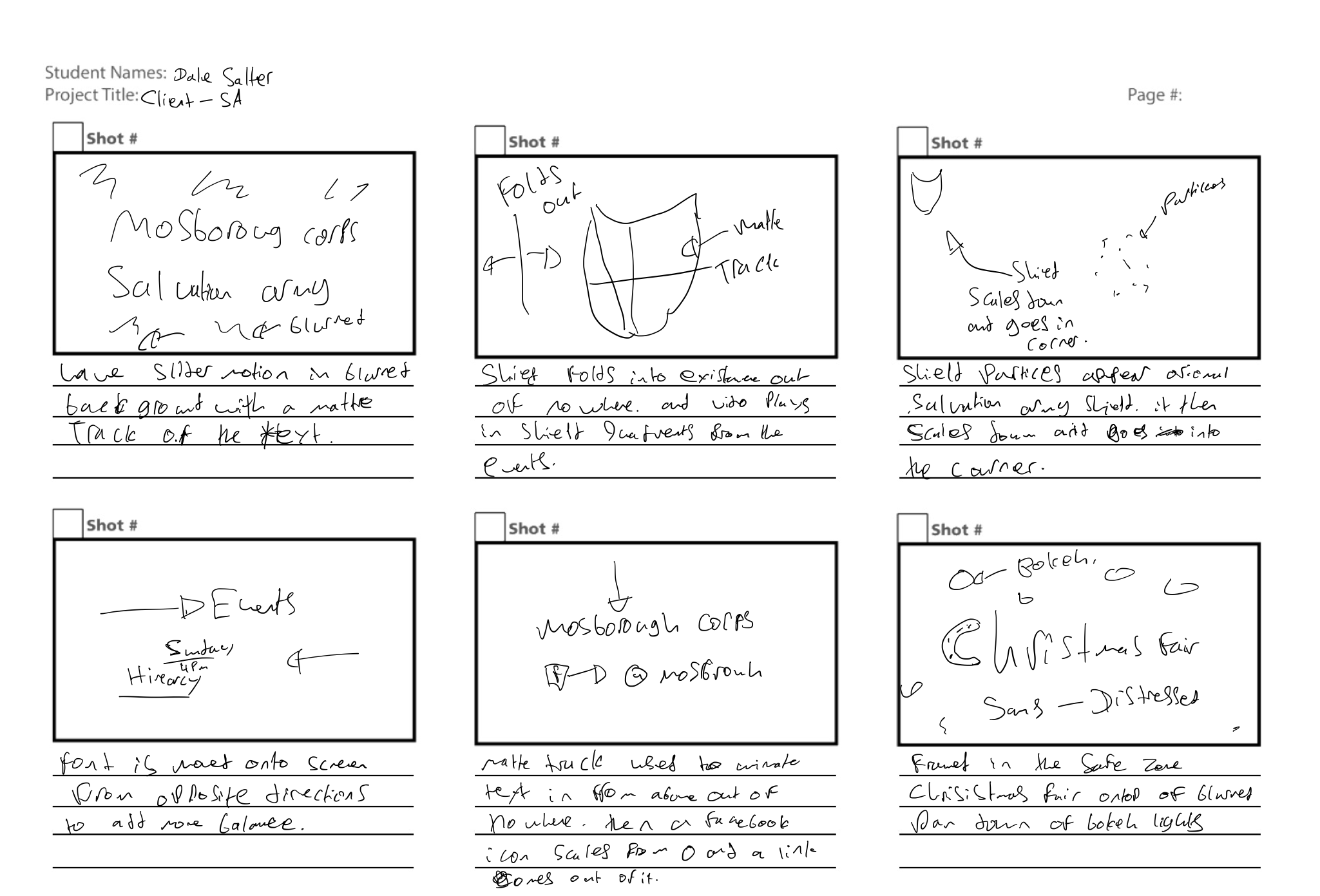
The videos to be created for the salvation army are required to get more people to come to the events, introduce what they do and promote them. For the client videos, it was necessary for two of them to require motion graphics to be implemented. These motion graphics are to introduce what the video is as well as inform the audience of when the events are.
These motion graphics are
(Main video) – A start screen with the name of it, Mosborough corps
(Main video) – An end screen informing the audience of the events available and when.
(Christmas Fair) – A start screen with the name of it, Christmas Fair
After talking to the client the main video I knew the kind of feel the client wanted, I researched into fonts and colour theory. I read some chapters from books on motion graphics and looked up some articles on colour theory. After doing so I analysed some main colours used by the salvation army on their main site and input them into adobe’s colour wheel.
I decided to use an analogous colour profile because according to Tiger colour “Analogous colour schemes use colours that are next to each other on the colour wheel. They usually match well and create serene and comfortable designs. Analogous colour schemes are often found in nature and are harmonious and pleasing to the eye. Make sure you have enough contrast when choosing an analogous colour scheme.” Throughout the video, I plan on using some tones of these colours for grading the footage to go with the theme of warm and welcoming. I also plan on using these colours to create the beginning motion graphics.
Beginning Motion Graphics
After reading an article on (No Film School). I gained some inspiration to use a blurred background of footage sliding, as well as an idea I had already to use blurred footage as a matte track which I think will add interest with the movement.
After watching a tutorial on how to use motion 5 to create a matte track of text which I chose over after effects in this case because it was more effective at creating it because it meant a template could be made that would then be in final cut pro which I was editing the main video in however for other more complex motion graphics it is better to use after effects for motion graphics to produce them to a more professional level.
I created the effect in motion 5 by adding in the text(Georgia, bold), which I went with because it matches the original salvation army font however not precisely because I thought this was more appropriate to the piece being a Traditional sherif which is a humanistic font. I then added a track matte to the text as well as an insertable background which I then exported to be used in final cut pro. After doing so I inserted footage I had of slider shots from a harvest festival meal event. This went well and after adding some more saturation and colour grading following the analogous colour scheme mentioned above the start motion graphics were finished.
End Screen
I looked into various end screens, however, most of them ended up being for videos and were all on one screen, and not what my idea is for the end screen to be like. I did like how some of the objects and words were animated in the video above and took some inspiration from it to use speech graphs to get some of the same smoothness and stopping with a bit more character than just a basic position animation.
This slideshow requires JavaScript.
Following my storyboard for how the motion graphics would go I created a matte track of a shield by masking around a salvation army shield and splitting it into four quadrants I then used footage from events and created track mattes. After doing this I animated the footage inwards and reversed the motion to create the effect of a shield folding out of nothingness. I did this because it catches the eye of the person watching the video according to motion graphics rules as it is in the safe zone. I then animated various groups of the text of the events coming in using speed graphs and animating position on the x-axis, I did this because I wanted it to look a bit more interesting and using the speed graphs did that by adding a slight smoothness and jarring at the end of the animation. I also animated text to come from under their hierarchy titles seemingly out of nowhere using track matte boxes over the text. I also did the same thing with the Facebook Icon, which went as planned. I went with a sans serif because According to – Medium. muzli – “it is a minimal and modular sans-serif font used in many sites, which gives a futuristic look to the design. Use the bold and extra bold weights of Avenir for emphasis with the light, book, and medium weights.” I did this because for the piece which needed to be warm and welcoming a humanistic monospace type font was required. Whilst alining the texts I used some Hierarchy after reading a book shown above from(PRACTICAL_RESPONSIVE_TYPOGRAPHY), to make the events more prominent and to give the piece a more interesting feel of difference but not so much as to start mixing fonts as it wouldn’t have been appropriate for this piece.
For this piece I used certain colours from the research I did earlier on after looking on the main website(SA), However I decided to go with using subtractive and addictive colours Black and white as to make the motion graphics simple and readable rather than something over the top which I wasn’t going for I was going for minimalistic.
Christmas Fair
After reading the article about motion graphics I talked about earlier I wanted the background to be blurred and of footage, However, I decided on the Christmas fair it would be better to go with basic text than with a track matte as used for the main video, because as talked about in the article Robbins mentions “a technique used by Peter McKinnon that really helps bring attention to the motion graphics he’s using: blurring out the background. It’s definitely one of those “why didn’t I think of that” kinds of things, but it’s true—adding a little blur to your footage will allow your graphic to stand out in all of its glorious sharpness, drawing your viewers’ eyes, and making you look like a clever little motion graphic designer.” Even though the track matte worked for the main video it didn’t have the outcome it should have to be to bring the attention to the motion graphics to make it stand out and have more clarity.
After deciding on using a blurred background of bokeh and a basic text(White) with no track matte. I went with a distressed “Gaz” which is grunge, novelty and display sans font family. This typeface has nineteen styles and was published by Typodermic Fonts Inc. I did this because it is slightly different to other sans fonts but still retains the readability and minimalist humanist nature which goes with the friendly mood I wanted for this piece. “They generally give better readability in print than on a screen, probably because of the better definition and evolution of the former in hundreds of years, while the latter technology is, on an evolutionary path, a newborn.” – PRT I went with a distressed font to add some more interest to the font to gain the audiences attention rather than just using a fully solid typeface. I went with a white text to get the best readability and not a primary colour because I wanted it to be simple and readable and minimalistic.
For this video, I mainly used just washed-out colours although I did subtly use the colours I looked into analogous at very low levels inc certain clips, however not that much as I felt that being a Christmas based video I was better to go with a soft feel without too much heavy colour grading. I did, however, add in some light purplish and blue hues in to give it a colder look to be more appropriate to the time of year it will come out.
The beginning motion graphics fit the piece, however, in reflection, it may have been more effective to use a more readable font as well as colour. It could have been improved by not having used a matte track as even though it’s readable it’s not as clear as it could be and clarity is important in motion graphics. The end motion graphics is appropriate to the piece however the text goes to fast and could have been improved by slowing it down. I didn’t do this because it already lengthed the video substantially perhaps it wasn’t necessary as the details for the events are above the video on the main website. Throughout the process of creating the motion graphics for the main video various client communication occurred(See in appendix – WBL Blog Post -) and the client was happy with the motion graphics, in the end, however, in my opinion, the motion graphics in this video could have been made better to be at a professional motion graphics standard.
The motion graphics in this video although short were effective at telling the audience this video is about a Christmas fair and had good clarity. however, it could have been improved by adding in some more motion graphic throughout with animation to assist the video in keeping the audience’s attention and making the video to more of a professional standard motion graphics wise. The colour grading used in this video was appropriate for the piece and helped create a mood, However, this could have been improved by having done more research into colour science. The client was happy with the video however there could have been more communication here to ensure that what was wanted for the motion graphics is definitely what is delivered.